GHCN: High Alt, High Lat, Rural
In the Summary for Policy Makers in Watts’ and D’Aleo’s Surface Temperature Records: Policy Driven Deception, there is the following claim:
5. There has been a severe bias towards removing higher-altitude, higher-latitude, and rural stations, leading to a further serious overstatement of warming.
Here I examine the effect of removing high altitude, high latitude, and rural stations using the GHCN raw data and applying the published CRU station gridding and averaging code.
First: How does losing high altitude stations affect the temperature anomaly plot?
I use 3188 GHCN raw stations for the baseline series. Then I remove all the stations over 1000m. (Very roughly 10% of them). The first plot is the baseline (red) and the low altitude series (blue), The second plot is the difference between the two series (same scale on both plots).


Second: How does losing high latitude stations affect the temperature anomaly plot?
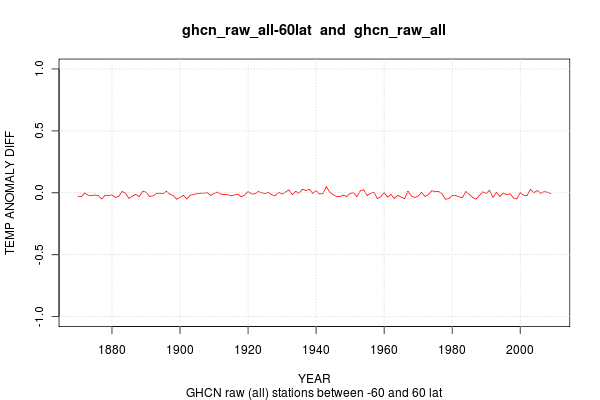
Again, I use the 3188 GHCN raw baseline. Then I remove all stations above 60N and below 60S. The baseline and low latitude stations are then compared.

Third: How does the urban stations affect the trend?
Here I used the GRUMP* GPW gridded population data at 2.5′ resolution to find stations that are possibly urban. I applied a filter that removed all stations in areas with more than 100 persons per square mile. This is much lower than the US Census definition of an urban area (1000/sq mile) or urban cluster (UA + neighboring regions of 500/sq mile).


Of course, the full claim is that the decreasing number of HA, HL, and rural stations in recent decades has artificially inflated the global temperature anomaly in recent decades. Comparison of the satellite anomaly trend and satellite anomalies with the surface records (sea+land) is sufficient to falsify that claim – unless the satellite record has also been artificially manipulated to show the same anomalies
woodfortrees.org CRU and RSS: 12 month ave and trends
woodfortrees.org Linear Trend for CRU, GISTEMP, UAH, RSS
———
Update 2010 02 13: Conflated GRUMP with GPW. The later data set was used in this analysis.
———-
Further Discussion
Zeke Hausfather @ Yale Forum on Climate Change and the Media
http://www.yaleclimatemediaforum.org/2010/01/kusi-noaa-nasa/
Roy Spencer @ Global Warming
http://www.drroyspencer.com/2010/02/new-work-on-the-recent-warming-of-northern-hemispheric-land-areas/
Tamino @ Open Mind
http://tamino.wordpress.com/2010/02/23/ghcn-preliminary-results

Good luck exploring and blogging.
Just to clarify, you are feeding v2.mean (in it’s entirety, or without certain stations) into CRU’s gridder, and taking the resulting global mean?
One should first note that the claims about high altitudes and latitudes don’t make any sense in the first place. It’s a mean temperature anomaly that’s being calculated, not a mean absolute temperature.
Thanks for the good wishes.
I believe that the claim about the effects of losing HA/HL and rural stations are made because people are to some degree (intentionally or unintentionally) conflating cold stations with cooling stations. HA/HL stations will, on average, be colder than low altitude and low latitude stations. And rural stations are probably colder than nearby cities due to UHI.
Of course ‘colder does not equal cooling’ and ‘hotter does not equal warming.’
But it satisfies the purposes of those who seek to kick up dust and exclaim that things are too unclear to make the association of “cold = cooling” and never bother to prove it – or even deny that they ever intended to make the association.
I think it’s clear that’s what they’re conflating. Which is just strange, because the people making this argument well know that there has been strong warming at Arctic stations, as well as the Antarctic Peninsula – both very cold places.
In fact, they well know that excluding the Arctic results in less warming.
So I’m confused how they know that on one hand, and continue with this line about high latitude/altitude on the other hand.
GISS did something similar, showing global, global- NH high lat, global – SH high lat, and global – all high lat.
Click to access IntegArea.pdf
Here you see that removing the NH high latitudes results in a bit less warming; logical since that’s where warming has been stronger. Treatment of the NH high latitudes is mainly the difference between GISS and CRU, which is maybe why your method didn’t pick up on that.
I’d suggest gridding your data before performing the average. If you don’ then the mid-latitudes are way over sampled and removes the possibility of seeing any real effects, which probably exist.
For example, if I use gridded data (CRUTEMP3v) and average over 10° swaths, this is what I get:
Tdot (temperature trend) measured in °C/year.
Once you have this curve, you can go back and look at the effect of dropping higher latitude sites. (I believe that this is a more reliable way of computing these effects.) I’ll show that in a second.
First, I looked at the effect of dropped stations using the gridded average and since 1950 it’s not much:
Latitude bias
Prior to 1950, it did have the effect of artificially increasing the apparent rate of warming:
% bias in temperature trend introduced by shift in mean latitude
A 20% bias in trend sounds large, but relative to the uncertainty in the measurements prior to 1950, it’s probably barely statistically significant. Once you calculate the effect of the bias, you can also correct for this systematic error in the measurements (I haven’t done this, but it’s straightforward to do).
Also in mind that anthropogenic warming, as it is usually modeled, doesn’t kick in until roughly 1980, when rapid anthropogenic CO2 increase finally overcomes the cooling effected of increased sulfate emissions, e.g.,
GISS Model E.
The point of this is that the main effect of the latitude correction is to increase the amount of variability from 1850-1950, a period that was dominated by natural temperature variations.
In other words, the main effect is to increase the prominence of natural variations compared to anthropogenic forced ones. If you reduced that natural variability, the very real temperature increase since 1980 even stands out more starkly against the long term temperature trend.
I’d suggest gridding your data before performing the average.
Interesting links, Carrick.
Thanks,
It’s not clear in the post, but the data reported above is gridded using the station_gridder.perl script provided by MET CRU. See the CRUTEMP page on this blog for more info.
http://www.metoffice.gov.uk/climatechange/science/monitoring/reference/station_gridder.perl
It should be noted that dropping high latitude/altitude stations should depress the trend because of amplification of warming at high latitudes in the North and in the troposphere.
Cool.
Population, however, is only a proxy for “urbanity”. the cause of UHI ( usually elevated
night time figures or Tmin) physical cause, is changes in the material properties
( heat rentention) of the man made surfaces and changes to the flow characteristics
over the terrain. Population is a good proxy for this because in the US, for example,
we tend to use heat retaining materials and we tend to build tall things
( urban IR canyon for example )
one other things to look at is impervious surfaces. A combination of nightlights
and population.
http://www.mdpi.com/1424-8220/7/9/1962
http://ppg.sagepub.com/cgi/content/abstract/33/4/510
http://www.visionbib.com/bibliography/cartog933.html
Also, it would be very cool is you can produce a list of the sites your approach
classified as urban and those it classified as rural.
Two lists would be great: the worldwide list and the USA list.
the USA list can probably be checked against existing data and you can verify if your
approach actually picks out urban and rural sites.
Also,
what was the station count in the high lat case?
is there a pointer around to your code so other people can use it and output other info?
Ron:
Thanks for the clarification.
And Chad I agree with you. The problem Smith has is he is using absolute temperature rather than temperature differences. If you look at the problem “correctly”, which is in terms of trends, then obviously dropping the high latitude stations will reduce global temperature trend.
I need to update the GHCN page here.
But the basic algorithm is not hard:
Take GHCN v2.mean or v2.mean_adj
Break it into individual station files.
Merge multiple records into a single record.
Reformat file into a ‘crutemp’ format while calculating baseline ave and s.d.
Run ‘crutemp’ station gridder
Run ‘crutemp’ global ave.
To add a ‘filter’ such as alt, lat, or pop,
just throw in an if statement in station gridder.
Steve, all good questions: code, pop, station count, station list.
Been working OT and weekends lately.
Not sure when I will get time to post clean code
Or dig into the answers to your questions.
Might be next weekend (March 6-7).
Nice work, thanks for the link at Lucia’s. As a lay reader, I appreciate your tone, and the clarity of the graphs. Also the technical follow-on commentary from ‘all sides.’
No worries. you should ask Lucia for a linky to your site. being on WUWT also has some benefits.
No rush on the questions.. just giving you a sense of what people look for.
Agreed with Amac! Maybe as more code gets released we will see people with different “temperments” presenting results. Keep up the good work Ron.
I don’t think its intentional. When I first saw this kind of thing ( more than a year ago)
I thought the loss of certain class of stations ( high alt in particular) would cause a problem.
CA regular Dr. Hu pointed out that anomaly method comes to the rescue. The only question
in my mind was/is whether GISS exact code does the right thing. But mathematically it
should make no difference. This is one of those cases where you really want to see that
the code implements the method AS DESCRIBED. Sure I can do an emulation of the method
and then test my emulation, but that’s a bass ackwards way of testing a simple question.
Can you confirm I am interpreting your urban area analysis correctly? The red line is all stations, the blue line is rural only? And in the next graph, it shows the results of all stations – rural stations? There is a pretty big departure of all areas from rural areas in the early years, showing a bigger warming trend for the urban areas, no? It does look like your results show some substantial warming in urban areas early in the record not seen in the rural stations, which peaks in the early 1900s, then since 1950 or so there is little difference between urban and rural.
Over the entire record the warming of all sites in excess of rural sites seems pretty small, maybe .4C over 140 years for a decadal rate of .03C/decade, with the full effect coming very early on, mostly before 1880. Eyeballing the graph 1880 to present there is no perceptible trend in the all minus rural data series.
You’ve got it. Blue is rural only, red is full data set.
As to ‘early years’, I don’t trust the pre-1900 data. Not enough stations in my opinion. Although I haven’t actually looked to see how many and where they are located – yet. Good follow-up question.
I also notice that the 1900-1940 shows slight more warming (~1C) in the ‘full’ than the ‘rural’ stations. So using only ‘rural’ stations, the 20th century trend is increased slightly. But remember – the definition of urban-v-rural in this graph is tagged to a static definition of the population density in the year 2000.
Have a look at brohan 06 on spatial errors. few stations just widens your CI. We use tree rings to reconstruct temps surely thermometers can be as accurate.
That’s a fun exercise. if you had to pick one thermometer to reconstruct the global temp which would you pick? if you had two? 3? 4?